
For the first time in club history, New York City FC have a third kit. Fans have become so used to the alternating home or away drops at the start of each season, that the idea of having another kit in our repertoire will surely be welcomed by all.
In keeping with the theme of other third kits recently dropped elsewhere league-wide, the NYCFC Parks Kit pays homage to New York City. For this, the club partnered with one of the most-loved organizations in the city: NYC Parks.
Beyond the iconic, leafy logo displayed proudly at the entrance to all 1,700 green spaces operated by NYC Parks, lies a deep cultural, and even personal connection for New Yorkers.
Everyone has “their” park, right? Their own oasis in the desert of concrete, glass, and steel. Somewhere they can forget about the hustle of the city and kick back somewhere quieter, more peaceful, and more natural.
For those reasons, I love the concept of this collaboration. When anyone around the world thinks of New York, they might picture the bright lights of Times Square, or the skyscrapers of FiDi. But when a New Yorker thinks of home, they probably picture their neighborhood, their bodega, and their favorite park. The club has tapped into that IYKYK feel in an awesome way.
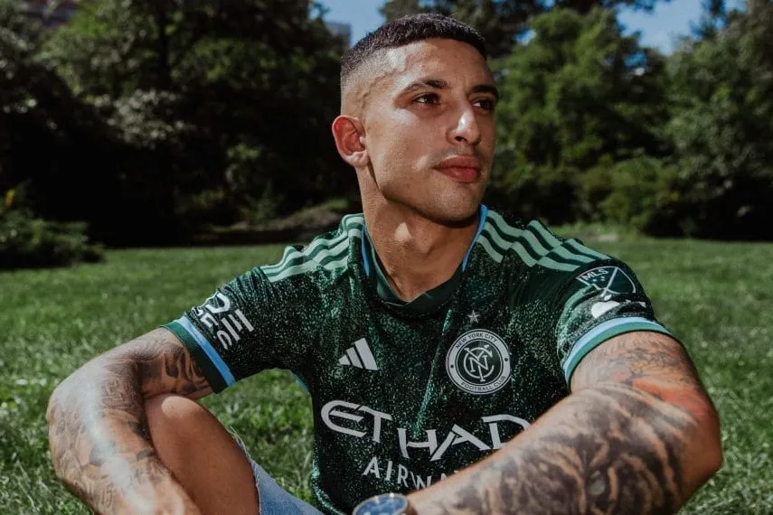
Designers of the new kit, however, took a pretty simple avenue to represent this great Parks collaboration: The color green.
The kit boasts a dark green base accented by higher green hues to create a lush, forest-like feel. To keep it in theme with NYCFC’s traditional color scheme, sky blue piping runs down the edge of the torso and pops up around the collar and sleeves.
The finer details appear in the NYC Parks logo near the left hip, and with some classy, vine-like pattern on the back of the neck that reminds me a bit of the metalwork on the gates to Gramercy Park.

But, despite the bold colors and tidy details, I can’t help but think they could’ve done a bit more with such a great concept.
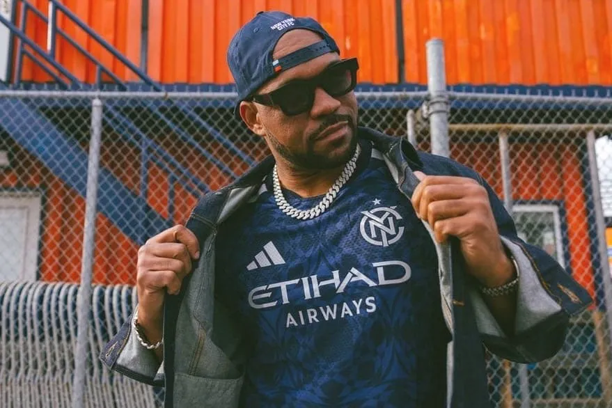
I was personally hoping for greater integration of the NYC Parks logo itself. Yes, we get that famous leaf on a small patch near the bottom of the kit, but I was hoping for that to be the showpiece of the shirt.
While the details of the shirt may be its greatest strength, they go away when you scale down from the Authentic edition to the Replica version of the kit. For example, the Replica lacks the blue accents on the sleeves and collar, the graphic on the back of the neck, and the all-important championship star above the crest.
And, given the astronomical prices of MLS kits, this puts potential buyers of the kit in a bit of a tricky spot.
Asking fans to pony up $149.99 for an Authentic jersey is unrealistic for many, never mind the $194.99 with a name and number on the back. And the more affordable (but still expensive) $99 non-player Replica jersey lacks the very details that make the kit interesting.
I know all Authentics look better than Replicas, but that difference looks even more significant in this case. Without the Authentic version, I can’t help but think that all that’s left is a whole lot of green and a small parks logo.
But, what do you think? Are you coppin’ it? Vote below to tell us how you feel about NYCFC’s first-ever third kit, and let us know what you’re thinking in the comments!