
Yesterday, we Power Ranked the 17 kits after Major League Soccer released ahead of the 2026 season. Now, we’re adding the 13 remaining 2026 MLS kits that dropped earlier this morning. Hudson River Blue convened a group of fashion experts and historians to discuss the uniforms and objectively rate their merits.
Joking! This power ranking of the 2026 MLS kits is an arbitrary exercise in judgment: The order is based on nothing more than personal taste, gut feelings, and vibes.
1) Dead Kit, San Jose Earthquakes
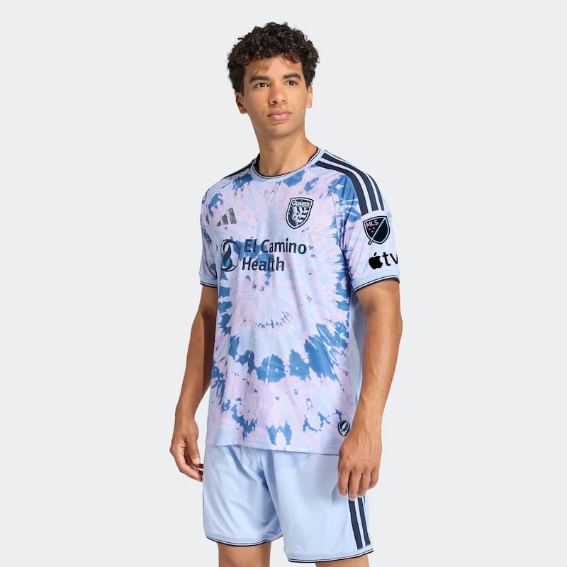
Is this the real reason Timo Werner signed with the Earthquakes?
Who can say. Another mystery: Why is San Jose the beneficiary of one of the most creative kits dropped this season? Although the Tina Turner Kit below is a close second.
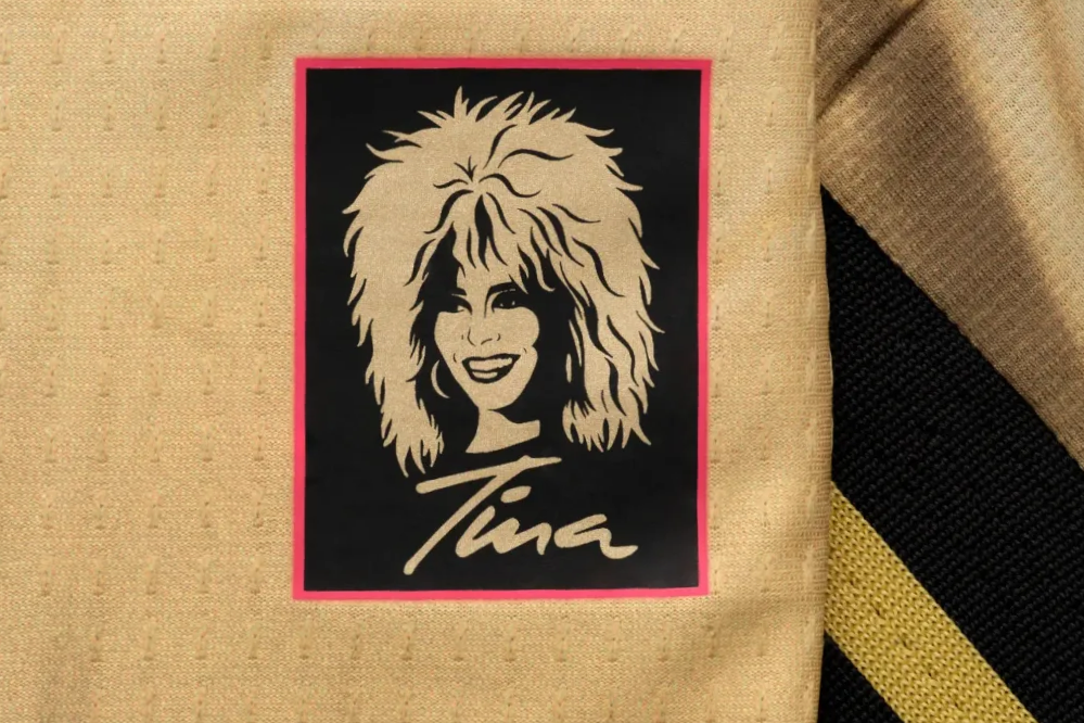
2) Tina Turner Kit, St Louis City
A shimmering tribute to the gold shifts Tina Turner wore on stage? Chef’s Kiss.
Bonus: The portrait and signature of the Queen of Rock ‘N’ Roll. Could’ve been #1, tbh.
3) Rooted in Austin, Austin FC
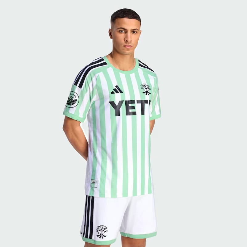
A masterful take on the classic Austin kit. Digging the lighter green, the graphic badge, the white shorts.
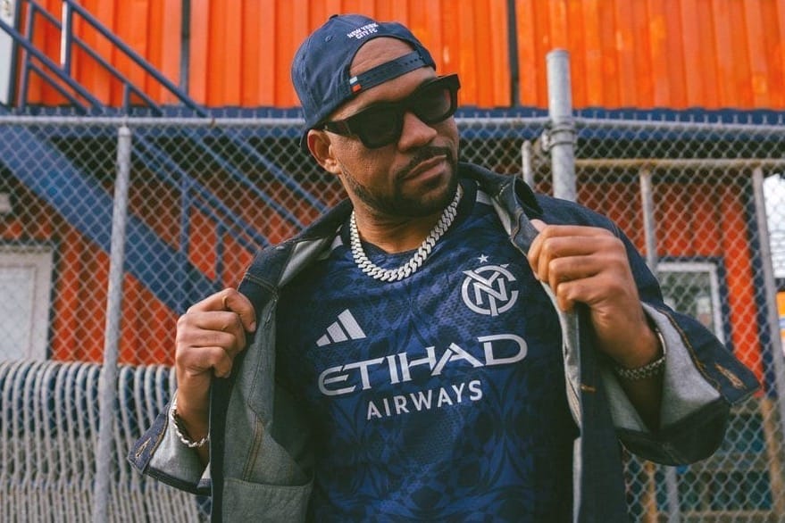
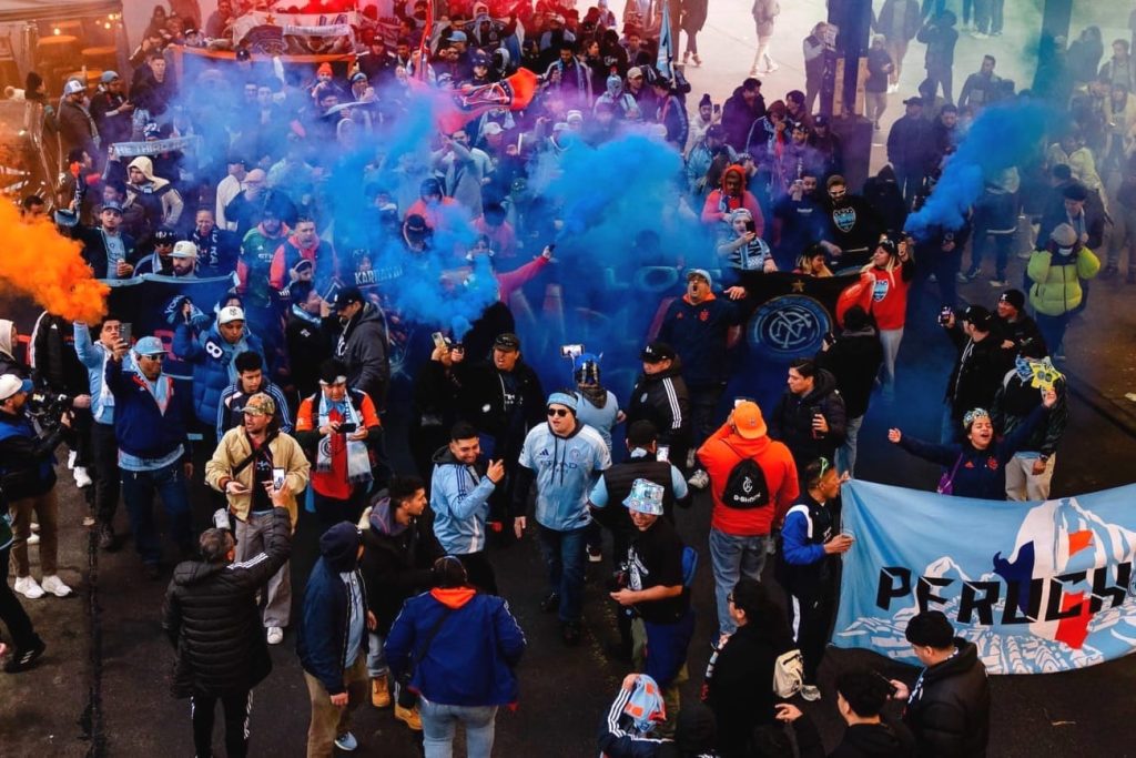
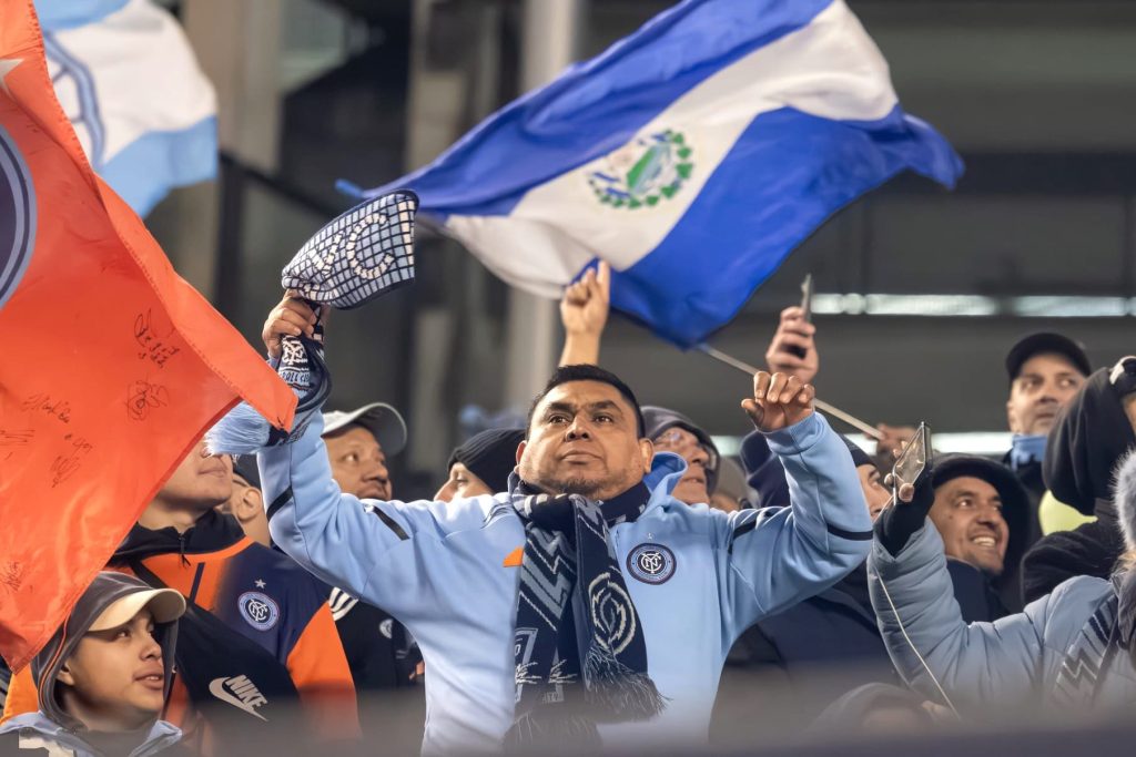
4) All Nations Kit, New York City FC
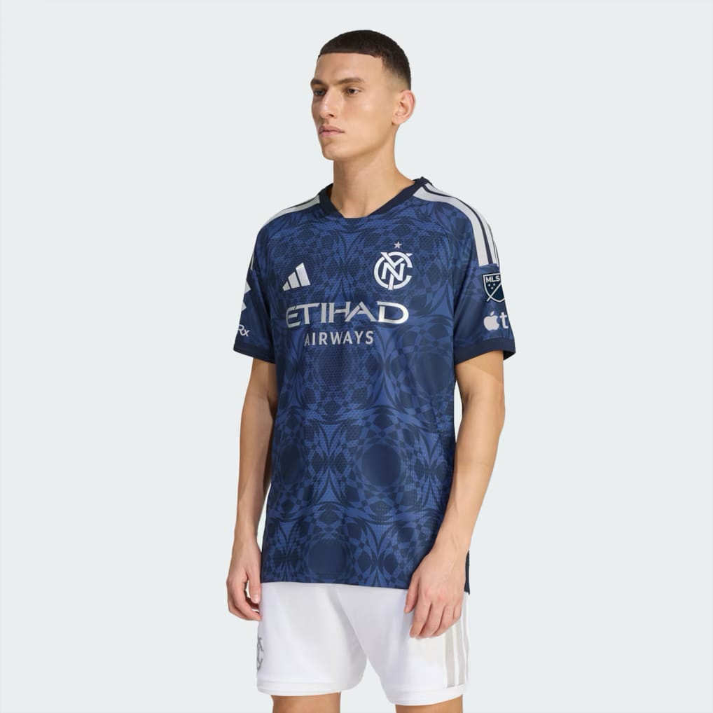
The shirt and shorts are just OK on their own, but it’s the bright orange socks (not pictured) that tie it all together a-la the French national team, only with the colors of the flag of New York City.
Enough of the monochrome uni: This is the age of the high-contrast kit.
5) Sunken Treasure Kit, Orlando City
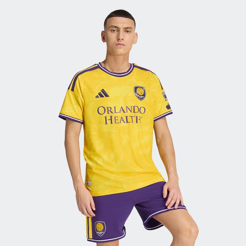
Orlando is leaning into the LA Lakers color scheme, and we’re here for it.
6) Civic Stadium Kit, Portland Timbers
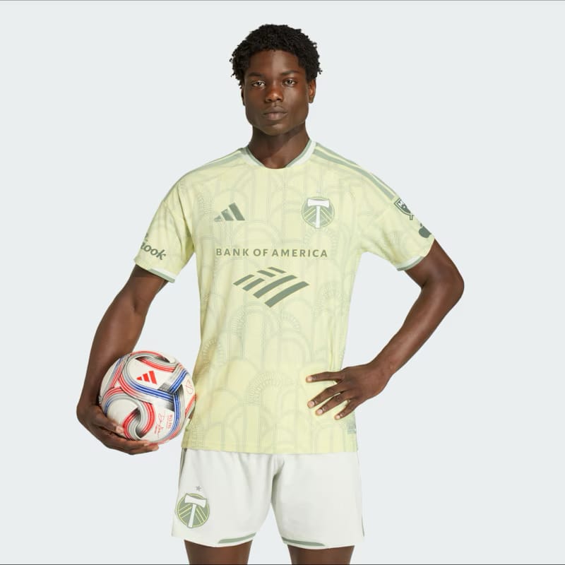
It’s not easy for a soccer shirt to pull off a light shade. The arch motif celebrates the 100th year of Providence Park.
7) Evergreen State Kit, Seattle Sounders
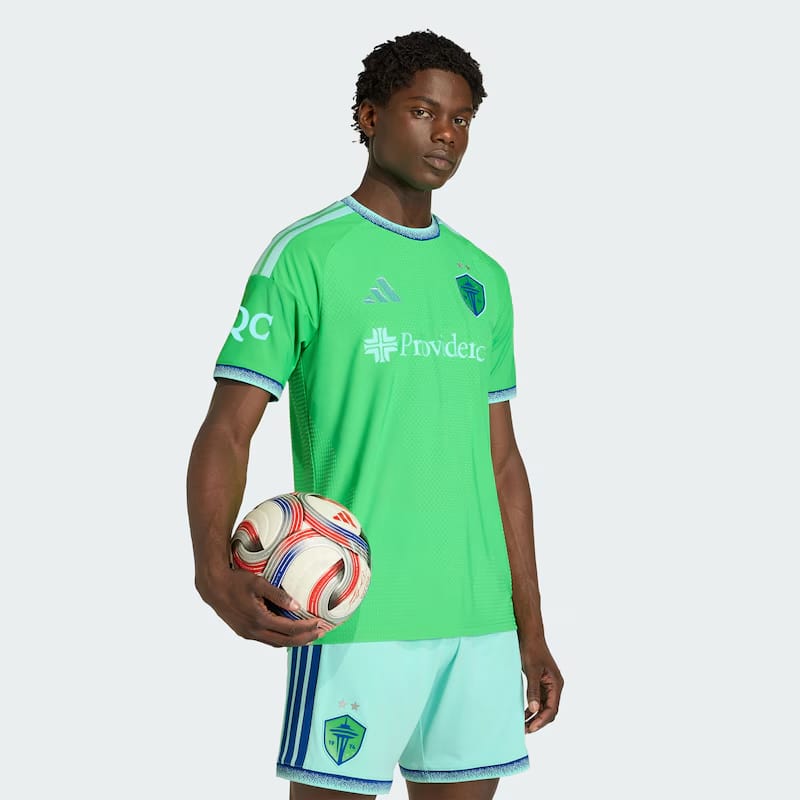
A return to a Clint Dempsey-era look after years of messing with patterns and stripes. It’s well executed, with nice details. The shorts seal the deal: Good color.
8) Seven Hills Kit, FC Cincinnati
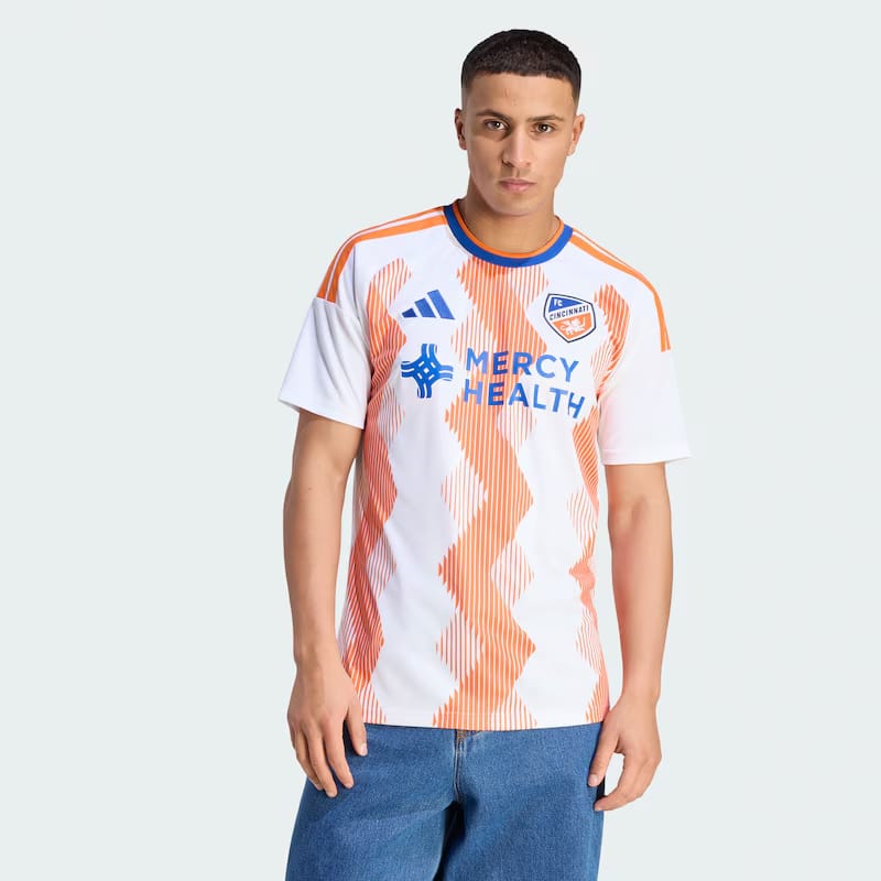
Creamsicle colors, patterned vertical chevrons: A solid secondary kit.
We’re still waiting for a Three-Way Chili Kit with a spaghetti motif.
9) Unprecedented Unity Kit, San Diego FC
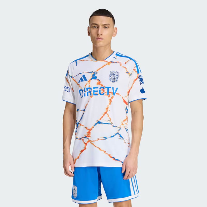
The name is a mouthful, but the kit is an upgrade over the vanilla all-white 2025 away kit.
Still, San Diego should look at what their Snapdragon Stadium roomies San Diego Wave are doing with their kits for some inspo.
10) VeloCITY Kit, LA Galaxy
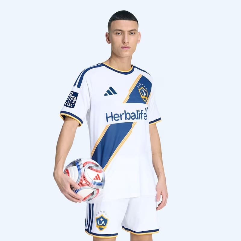
This is new?
That said, there’s a lot to recommend the classic LA Galaxy uni and that David Beckham-era sash.
11) Reverb Kit, Nashville SC
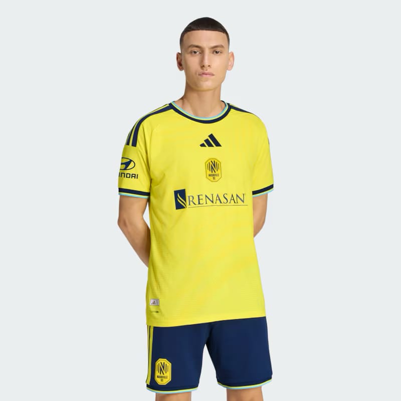
This is new? To be fair, the badge is now in the center, and the trim is different, but it looks an awful lot like 2022. Nashville, like LA Galaxy, benefits from a good classic look.
12) Switchback Kit, Real Salt Lake
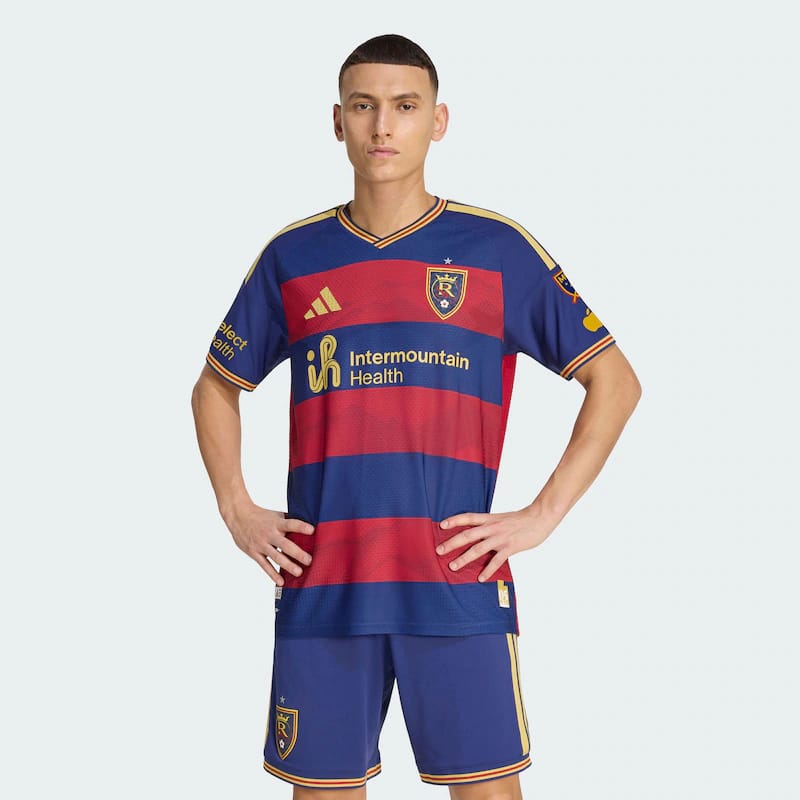
A new design that feels timeless. No notes.
13) Coastal Kit, Vancouver Whitecaps
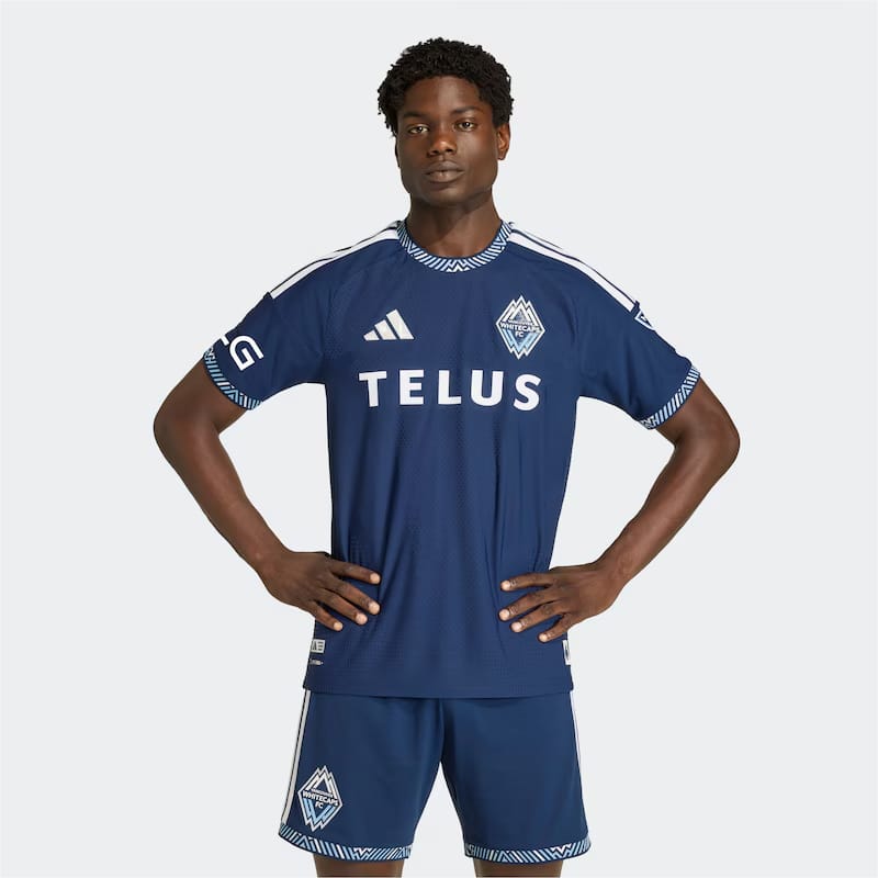
The trim on the neck, arms, and legs saves it: While most of this year’s monochromatic kits are banished to the bottom of this list, Vancouver’s Coastal Kit has just enough going for it.
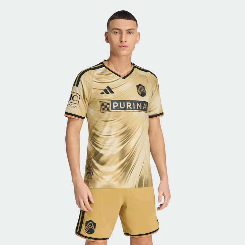
14) Primary Kit, LAFC
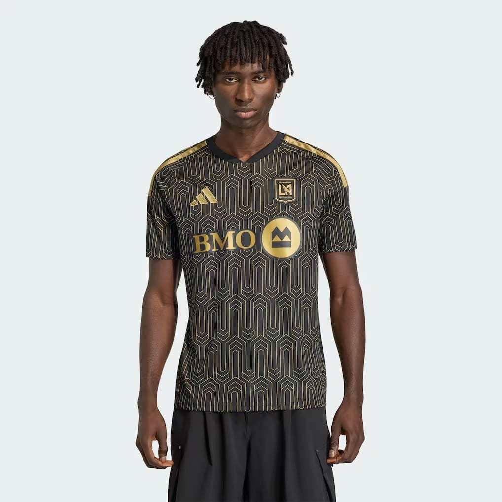
A design that strives to refer to “the Art Deco architecture” of Downtown Los Angeles, but instead looks like the tiles in the bathroom of an Instagram-famous matcha cafe.
Also: What’s with the non-name?
15) DNA Kit, FC Dallas
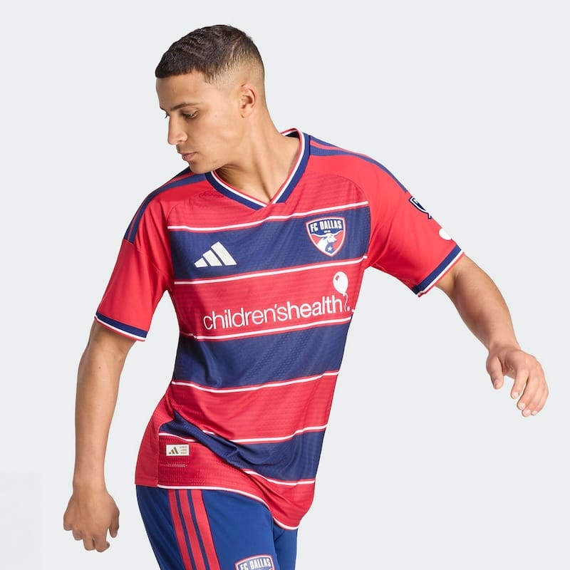
See Real Salt Lake, above.
16) Colorful Colorado Kit, Colorado Rapids
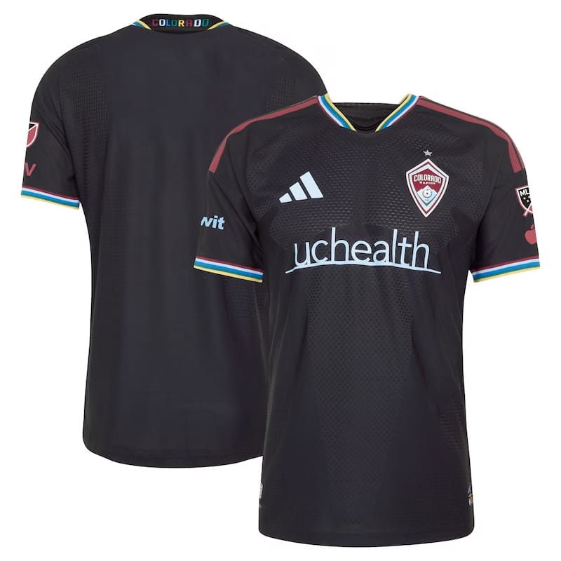
What you get after the design team runs out of ideas. A black shirt with superhero armor texturing gets the name “Colorful” because, well, there are a bunch of colors on the trim? Weirdly, it kinda works.
17) Independence Day Kit, New England Revolution
Can you not really have an opinion about a kit? Although our friends at The Blazing Musket are all-in.
Fun fact: New England has missed the playoffs in three out of the four years since switching badges and ditching the crayon for the coaster.
18) Mission Control Kit, Houston Dynamo
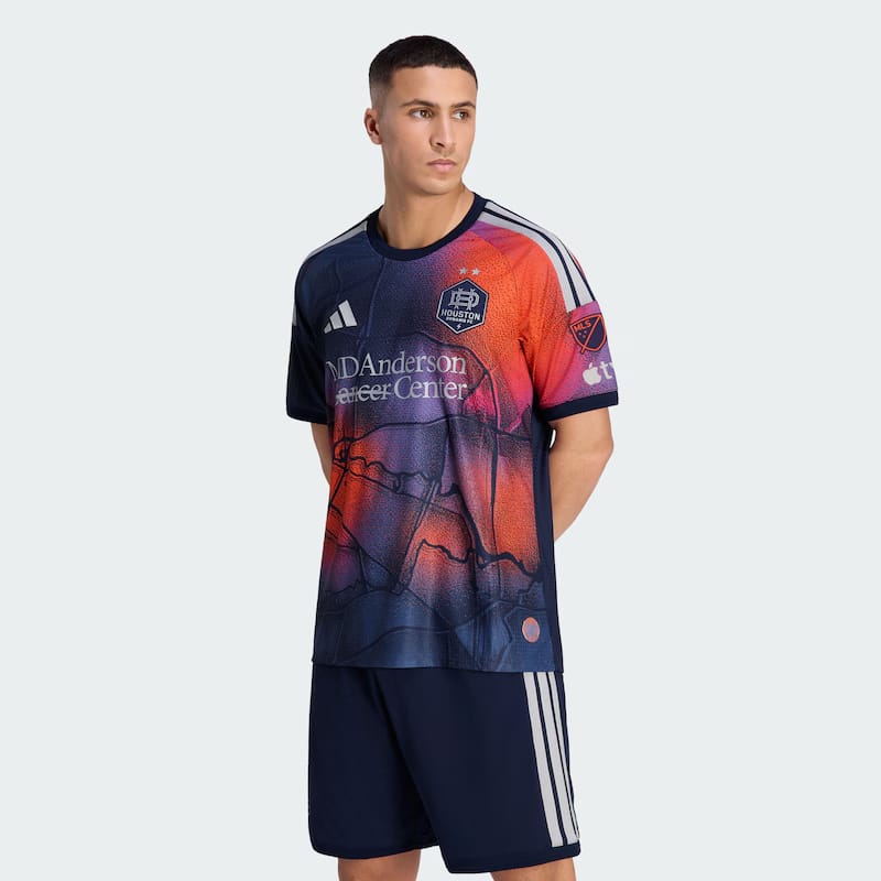
At least they tried.
19) Winter Kit, Toronto FC
I can’t believe it’s not Ajax!
Good on Toronto to embrace their snow-bound identity, but not sure the kit is up to the name.
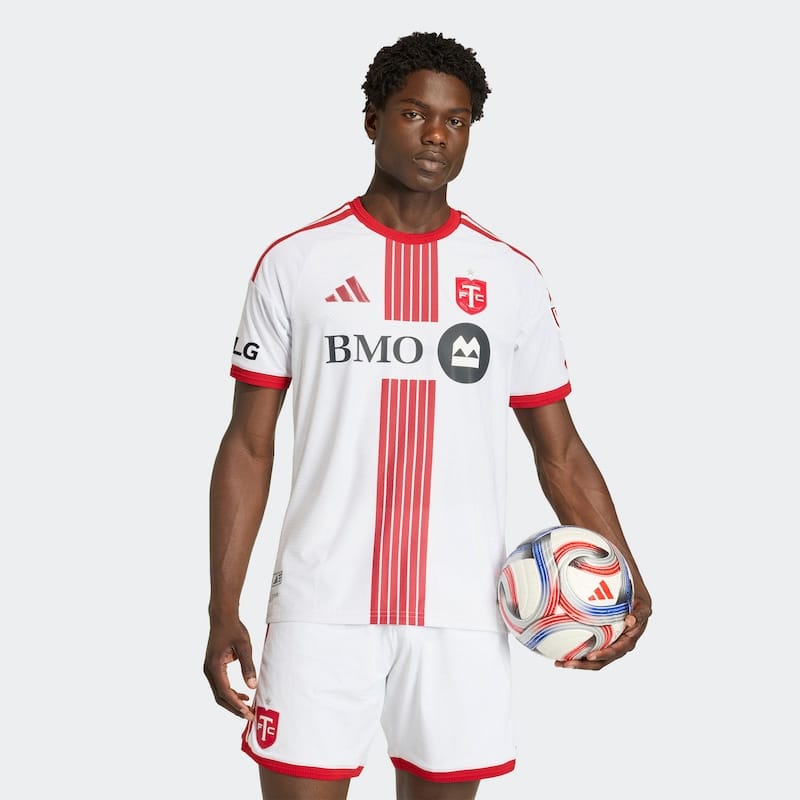
20) Procure Jersey, CF Montréal
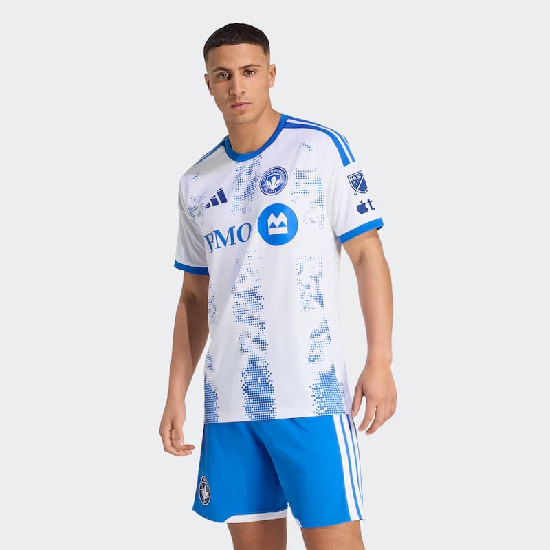
Looks like the packaging for an upscale moisturizer.
21) Spirit of ’96 Kit, Atlanta United
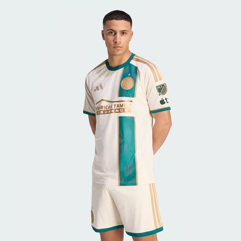
Isn’t this the outfit they give you at one of those mega-sized Korean spas?
And the name is confusing? The ’96 refers to the 1996 Olympic Games, but it feels like stolen valor for the inaugural season of MLS.
22) 18th & Vine Kit, Sporting Kansas City
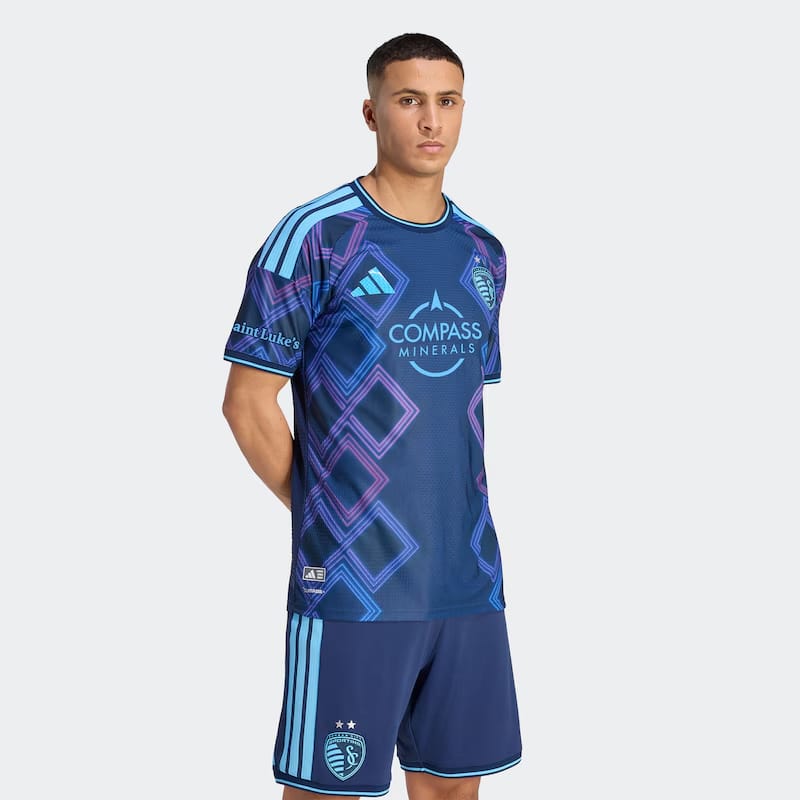
It’s not easy for a kit with this much color and patterning to also be this forgettable.
23) Decade Kit, Minnesota United
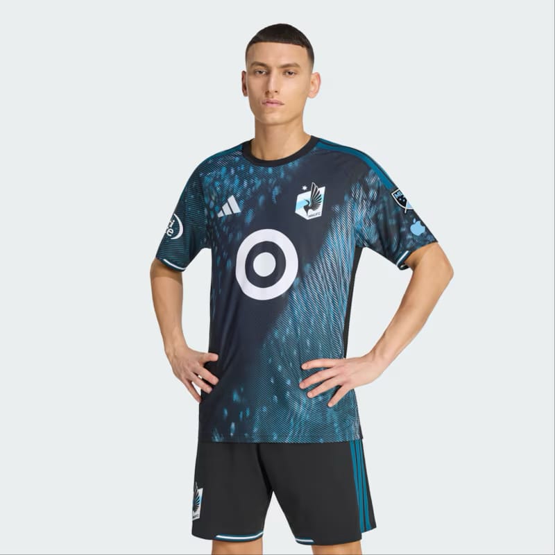
Not bad, but not distinctive. We’re always pro-sash, even if it’s rendered in negative space.
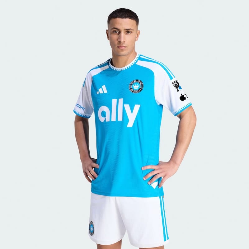
24) Carolina Kit: Crowns Up, Charlotte FC
This is new?
Too bad it’s a step back from the gradated blues on the 2024 Carolina Kit.
25) Rooted Kit, Red Bull New York
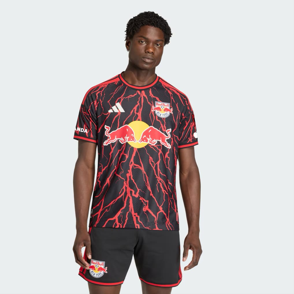
More like the Vecna Kit.
When will Red Bull embrace their New Jersey heritage, and celebrate the local industry that built that diverse community? We’re waiting for the Ironbound Kit.
Also: Two Rooteds in one MLS reveal? Somebody forgot to send a memo.
26) Crafted for Excellence, Columbus Crew
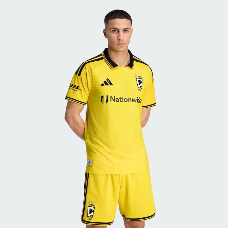
This is new?
27) 1776 Kit, Philadelphia Union
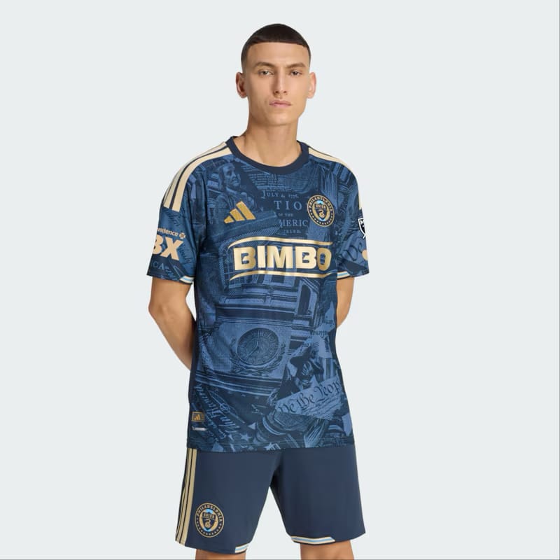
A busy print that looks like the adhesive art you find in an Airbnb.
Philadelphia will forever be chasing after the elegance of the 2022 For U Kit.
28) Black and Red Kit, DC United
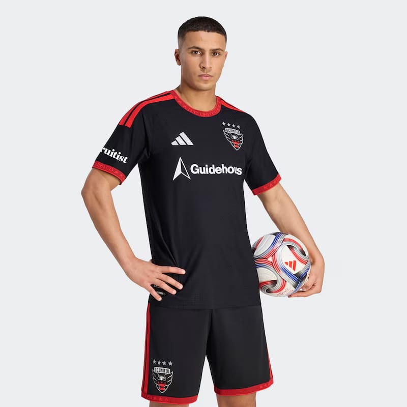
Tries and fails to pull off what Vancouver managed. (See above.) Even the name is phoned in.
29) Forever Red, Chicago Fire
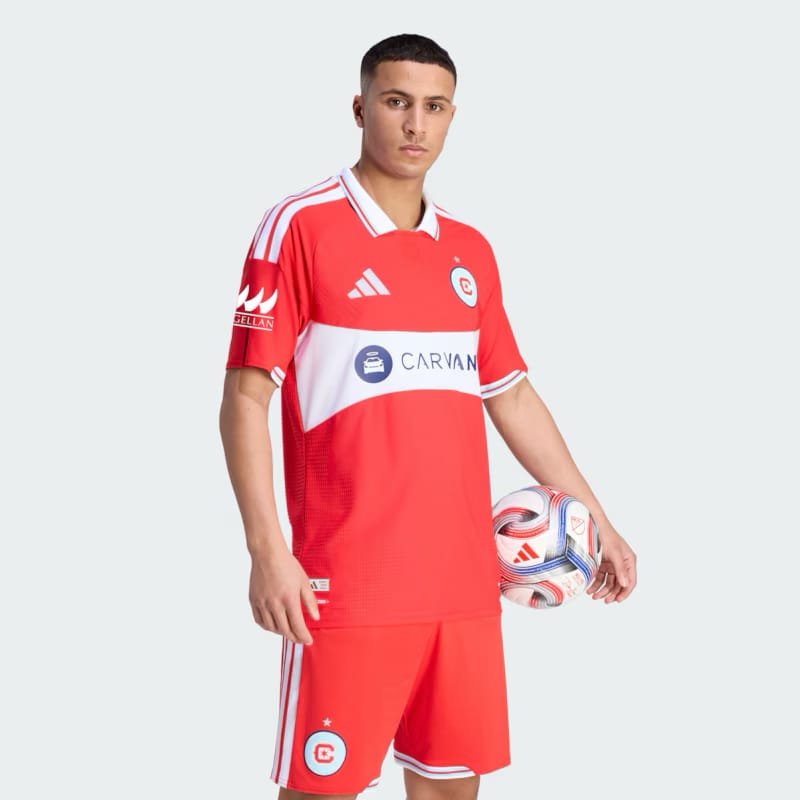
This is new?
Also: Somebody forgot to give Chicago the memo that monochrome kits are out.
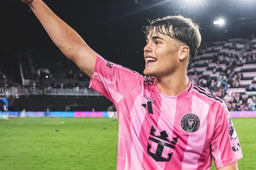
30) Presagio Kit, Inter Miami
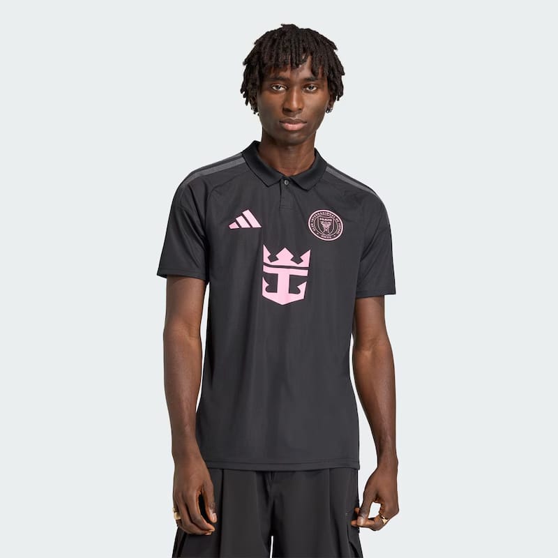
Is this a secondary kit, or what the valets will wear at Miami Freedom Park?
Nothing says “we play soccer in a subtropical climate in the summer” like an all-black uni with a collar.
No worries: Miami will still move 100 million of these shirts with Lionel Messi’s name on the back, and street vendors will sell another 1 billion knockoffs.
Disclosure: This post contains affiliate links, and Hudson River Blue will receive a commission from sales using these links.
lol well put. glad NYCFC one’s on supposedly on a better side. it’s like the half of ’em was done on a whim rushed by morning deadline, putting too much time on the better ones… that portland kit should be named ‘clorox dip’. RBNJ one looks just plain bad (comparing to their recent cool ones…).bold choice for the name, SJ, The Dead. wow.